
Category: Multimedia Learning
In the assignment, I found that people use Canva as a tool to make their resume infographics. I think this is an opportunity to use the design principles (Mayer, 2012) I learned in these two weeks to try to make my resume infographic on Canva. Meanwhile, I will use Wave to analyze my infographic, find more areas for improvement, and summarize my result
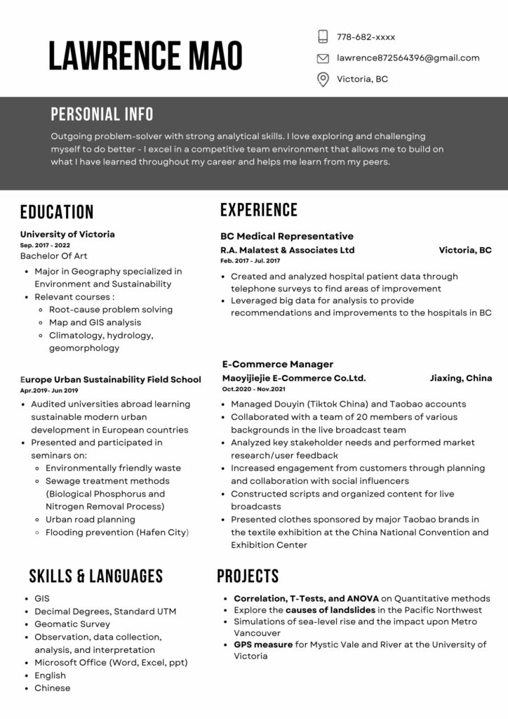
Canva Infographic
Design Principles In My Infographic
- The principle of alignment is extensively used in infographics. Correct alignment can make the text more readable and easier for everyone to understand. For example, I set my education to one row and my work experience to one row, which aligned the two rows left and right so people can easily find my content, and consistency helps reduce visual clutter.
- Hierarchy: By deliberately enhancing readability, such as by distinguishing titles, subtitles, and body text, hierarchy improves the readability of content. Titles or important information can be in bold, large, or unique fonts. I also place them at the top or center of the design elements, or elements that follow the viewer’s natural reading path (e.g., left to right, top to bottom in many cultures) are seen first.
- Color scheme: Use a consistent color scheme throughout the infographic. Since this is a resume in a formal format and reducing color noise is a must for a resume, I only used black and white with a dash of gray as the main colors to reduce information noise while bringing a sense of stability to the design, using repetitive and effective information that was quickly conveyed to the interviewer. My general introduction uses black as the background and white as the text to allow readers to quickly understand the important information I want to convey and my general outline.
- Symmetrical balance (formal balance): elements are mirrored around a central axis. Draw a line in the middle of my design; the two sides will almost mirror each other. Disperse complex elements to avoid concentrating them in one area.
Graphic design is inherently visual; what additions or modifications could you make to ensure that learners with visual impairments have access to the same information in an infographic in an online setting?
- Use high-contrast colors: Make sure there is enough contrast between the text and the background so that even people who are color blind or have low vision can see the content clearly. Avoid using indications based solely on color
- Provide textual descriptions: Provide textual descriptions or alt text for graphics, pictures, or other key visual content.
- Use semantic HTML: screen readers can interpret and read the content correctly.
- Use audio and video: Provide audio or video content for learners who may have difficulty deciphering text or graphics.
- Check test accessibility
wave
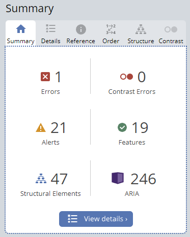
There is 1 error (empty link), 21 alerts (1 suspicious alternative text, 1 long alternative text, and 19 redundant links), 20 features, 47 structural elements, and 246 ARIAS.
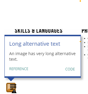
Alt text is crucial for visually impaired users. I rely on screen readers to read the content of web pages aloud and to ensure that users who cannot see the image can still understand its message and content, I need to improve it.
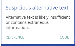
An image may describe one thing, but alt text may convey false or misleading information, potentially guiding screen reader users’ interpretation in a deceptive manner.
Conclusion for Wave: Wave’s summary surprised me, and some of it is confusing. There are many details I still need to work on and improve on my blog. For the Aria, it is 246, and I still do not understand why there are so many ARIA compared with other classmates.

- Which principles did you have in mind when you were creating your screencast? Which were you able to employ, and which were more challenging to follow?
I love playing badminton, and I have been playing badminton for 5 years. I made a screencast about the badminton racket introduction. I use the dual-coding theory in the screencast with both visual and audio content to aid memory and understanding. By displaying information on the screen while providing an audio explanation. Meanwhile, use the theory of intrinsic cognitive load to build my deconstruction icon, which is important to keep the material simple and clear and avoid unnecessary complexity. While it does not change the intrinsic load, using simple language and clear instructions can help ensure that extraneous load is minimized, helping learners focus more on the complex material at hand. I use social Cues principles such as the personalization principle in screenshots. When I present narratives or texts in a conversational manner instead of formal manuscripts, the information in multimedia learning can be better presented and retained. Also, recording in my own voice makes it more receptive for learners. I think that the screenshots have applied most of Mayer’s Principles of Multimedia Learning: Redundancy, Coherence, Signaling, Contiguity, and Segmenting. For example, I use different colors to mark the corresponding positions and names of badminton rackets, use the laser point tool on the Jamboard as a signaling method, and use the signaling principle to guide the “students” where to look, which can reduce cognitive load. Moreover, I introduce and analyze the functions of different parts in a coherent manner. However, I think the difficult one to follow is the German cognitive load because I am not quite sure about the unification of new information. As well as for creating new patterns and new knowledge in long-term memory, I am not sure if this achieves a better way of storing knowledge.
- Who did you imagine as the audience for this screencast? How did that impact your design choices?
My audience is people aged 5 to 70+ who are interested in badminton and want to get into this sport. Badminton enthusiasts can also learn more about their own badminton rackets through my screenshots. Meanwhile, it could provide some professional information for people on how to choose and buy badminton rackets and badminton strings that suit them. My screenshot design is easy to understand using my hand-drawn drawings, with a corresponding introduction next to the drawing, and my language will be relatively straightforward with the information. So the screenshot basically makes it easy to understand badminton racket information without any threshold.
https://screenpal.com/watch/c06Vf6V5F85
Hi, I am Lawrence Mao, a fourth-year undergraduate student in geography at UVIC. Beyond the classroom, I like playing badminton and traveling. I also like to eat food from all over the world. By the way, I want to introduce my hometown, Zhengzhou, China. It is the capital city of Henan Province in central China, and Zhengzhou has a rich history dating back over 3,500 years. Meanwhile, its location in the center of China makes Zhengzhou a significant transport hub, especially for railways. If anyone wants to travel to Zhengzhou, Shaolin Temple is the place I recommend visiting. It is known as the birthplace of Chinese martial arts.

What interests me about interactive and multimedia learning is its capacity to engage diverse learners. Not everyone processes information in the same way. Some of us are visual learners, while others benefit from auditory or kinesthetic experiences. Multimedia caters to these varied needs, creating a rich tapestry of experiences that can be tailored to suit individual preferences. Moreover, interactivity fosters engagement. It could help us promote critical thinking and problem-solving and help us prepare for challenges outside the confines of traditional learning environments.
Before proceeding with this first blog post, we expect you to consider your privacy preferences carefully and that you have considered the following options:
- Do you want to be online vs. offline?
- Do you want to use your name (or part thereof) vs. a pseudonym (e.g., West Coast Teacher)?
- Do you want to have your blog public vs. private? (Note, you can set individual blog posts private or password protected or have an entire blog set to private)
- Have you considered whether you are posting within or outside of Canada? This blog on opened.ca is hosted within Canada. That said, any public blog posts can have its content aggregated/curated onto social networks outside of Canada.
First tasks you might explore with your new blog:
- Go into its admin panel found by adding /wp-admin at the end of your blog’s URL
- Add new category or tags to organize your blog posts – found under “Posts” (but do not remove the pre-existing categories or sub-categories). If you would like to add more course categories, please do so (e.g., add EDCI 306A with no space for Music Ed, etc.)
- See if your blog posts are appearing on the course website (you must have the course categories assigned to a post first and have provided your instructor with your blog URL)
- Add pages
- Embed images or set featured images and embed video in blog posts and pages (can be your own media or that found on the internet, but consider free or creative commons licensed works)
- Under Appearance,
- Select your preferred website theme and customize to your preferences (New title, etc.)
- Customize menus & navigation
- Use widgets to customize blog content and features
- Delete this starter post (or switch it to draft status if you want to keep for reference)
Do consider creating categories for each course that you take should you wish to document your learning (or from professional learning activities outside of formal courses). Keep note, however, that you may wish to use the course topic as the category as opposed to the course number as those outside of your program would not be familiar with the number (e.g., we use “Multimedia Learning” instead of “edci337).
Lastly, as always, be aware of the FIPPA as it relates to privacy and share only those names/images that you have consent to use or are otherwise public figures. When in doubt, ask us.