In the assignment, I found that people use Canva as a tool to make their resume infographics. I think this is an opportunity to use the design principles (Mayer, 2012) I learned in these two weeks to try to make my resume infographic on Canva. Meanwhile, I will use Wave to analyze my infographic, find more areas for improvement, and summarize my result
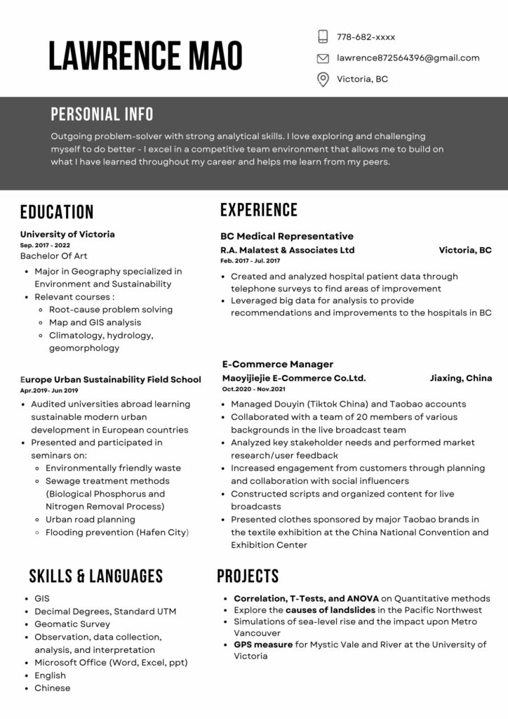
Canva Infographic
Design Principles In My Infographic
- The principle of alignment is extensively used in infographics. Correct alignment can make the text more readable and easier for everyone to understand. For example, I set my education to one row and my work experience to one row, which aligned the two rows left and right so people can easily find my content, and consistency helps reduce visual clutter.
- Hierarchy: By deliberately enhancing readability, such as by distinguishing titles, subtitles, and body text, hierarchy improves the readability of content. Titles or important information can be in bold, large, or unique fonts. I also place them at the top or center of the design elements, or elements that follow the viewer’s natural reading path (e.g., left to right, top to bottom in many cultures) are seen first.
- Color scheme: Use a consistent color scheme throughout the infographic. Since this is a resume in a formal format and reducing color noise is a must for a resume, I only used black and white with a dash of gray as the main colors to reduce information noise while bringing a sense of stability to the design, using repetitive and effective information that was quickly conveyed to the interviewer. My general introduction uses black as the background and white as the text to allow readers to quickly understand the important information I want to convey and my general outline.
- Symmetrical balance (formal balance): elements are mirrored around a central axis. Draw a line in the middle of my design; the two sides will almost mirror each other. Disperse complex elements to avoid concentrating them in one area.
Graphic design is inherently visual; what additions or modifications could you make to ensure that learners with visual impairments have access to the same information in an infographic in an online setting?
- Use high-contrast colors: Make sure there is enough contrast between the text and the background so that even people who are color blind or have low vision can see the content clearly. Avoid using indications based solely on color
- Provide textual descriptions: Provide textual descriptions or alt text for graphics, pictures, or other key visual content.
- Use semantic HTML: screen readers can interpret and read the content correctly.
- Use audio and video: Provide audio or video content for learners who may have difficulty deciphering text or graphics.
- Check test accessibility
wave
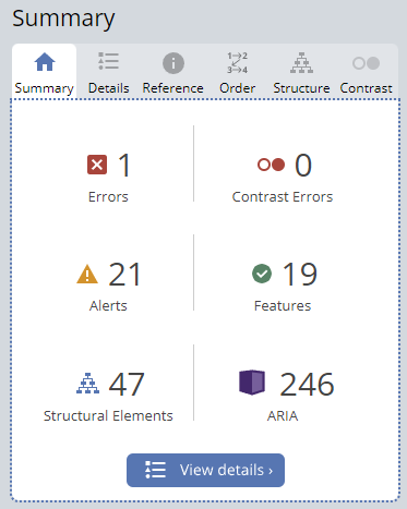
There is 1 error (empty link), 21 alerts (1 suspicious alternative text, 1 long alternative text, and 19 redundant links), 20 features, 47 structural elements, and 246 ARIAS.
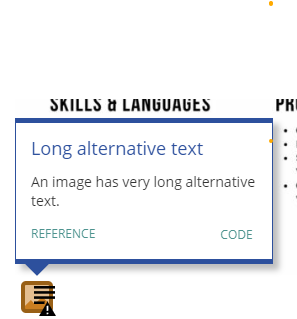
Alt text is crucial for visually impaired users. I rely on screen readers to read the content of web pages aloud and to ensure that users who cannot see the image can still understand its message and content, I need to improve it.
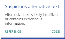
An image may describe one thing, but alt text may convey false or misleading information, potentially guiding screen reader users’ interpretation in a deceptive manner.
Conclusion for Wave: Wave’s summary surprised me, and some of it is confusing. There are many details I still need to work on and improve on my blog. For the Aria, it is 246, and I still do not understand why there are so many ARIA compared with other classmates.